- artists (39)
- career (11)
- contest (1)
- crostini (14)
- design (27)
- DIY (3)
- drupal hell (3)
- etsy (18)
- events (35)
- family (6)
- fun with google (6)
- gocco (6)
- I covet thee (13)
- Io parlo Italiano (10)
- lost and found (13)
- mc recommends (33)
- mixed media (25)
- multi-tasking (11)
- photo documentary (15)
- playing with food (5)
- projects (3)
- providence (39)
- reviews (23)
- sailing (1)
- site updates (4)
- softies (6)
- storytime (4)
- studio (21)
- the road less travelled (15)
- think green (8)
reviews, artists, Authored Articles
REVIEW: "Welcome To The Conversation": RISD Graduate Thesis Exhibition, Part 6
Wed, 06/04/2008 - 15:32 — adminYesterday was a silent blog day for me, as I was off to Newport to conduct interviews for my upcoming Artscope articles. Picking up where I left off, I'll be wrapping up my week-long review of RISD's Graduate Thesis Exhibition over the next two days, with posts on the highlights from the MFA sculpture and ceramics candidates.
Returning from a long, stellar day exploring Newport's art spots and beaches a piedi, I put my sandy feet up just in time to watch the ongoing political drama of the Democratic national party. Hillary's toothy, "non-concilliatory / concilliatory" speech to the Obama camp reminded me of the circus of RISD grad Milton F. Stevenson V's day-glo thesis installation "The Beginning Of My Ascension To The Center Of The Universe Vol.2".
On my first visit, the installation starred two, life-sized photo cutouts of the would-be Democratic nominees. On my second visit, I noticed that Obama was...missing? Regardless, we'll be seeing plenty of Mr. Obama from now on, and since that was the day I was shooting photos, my mom graciously stood in for him. Hillary didn't seem to mind, as she's here for the party!
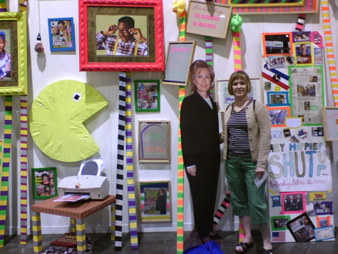
While I typically would not behave in such a manner at an art exhibit (editor's note: untrue), the content of this installation led me gleefully astray. Filled with tabloid deitritus, the installation is punctuated with hand-painted signs lettered with reactionary caustic remarks aimed at mass-media pop culture and high-art echelons alike.
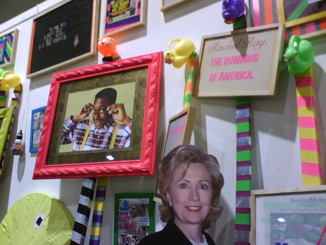
The framed slogan: "Rachel Ray: The Dumbing of America" held court adjacent to "Your Residency Sucks Anyway", carefully lettered in stylized day-glo paint over an actual rejection letter to the artist from the Skowhegan residency commitee.
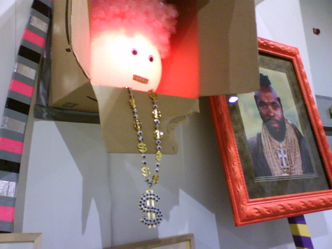
Looking on, a google-eyed audience of altered tabloid covers, cheap plastic toys and portraits of goofy pop icons like Erkel, Pac Man and Mr. T. amidst a temporary forest of tape-striped placard posts. I pity the fool who doesn't see the exorcistic joy in this installation. Still, I wonder if the high court art influencers behind, say, the Whitney Biennial will latch on to this one, who took such care to frame his ubiquitous orange ticket stub for display, mounted between the lines of a hand-painted "Worst Biennial EVER" slogan.
Also making the most of deitritus and day-glo, Chandra Glaeseman's installation held court at the front of the exhibit hall. Using a towering array of building materials, her sculpture "I Have My Doubts" appeared rickety, yet dynamic.
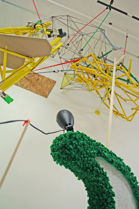
In the vein of Jessica Stockholder, the materials seemed chosen for formal impact in lieu of narrative value. In this case, it worked, although given the height of the main tower element I wished to see the installation set against an unbroken background, rather than the limited temporary wall of the exhibition hall.
In my next post I will wrap up this week-long review with one of my favorite experiences of the exhibition. Stay tuned!


REVIEW: "Welcome To The Conversation": RISD Graduate Thesis Exhibition, Part 5
Mon, 06/02/2008 - 19:15 — adminIn part 5 of my exhibition highlights from "Welcome To The Conversation": RISD's Graduate Thesis Exhibition, I would like to call attention to the graphic design department, which exemplified some very strong conceptual design work through displays in print, video and book format.
My favorite work from this department was by Leslie Kwok. I first noticed her work in a collaborative wall drawing/video piece "The Group Portrait", undertaken with the help of her cohort.
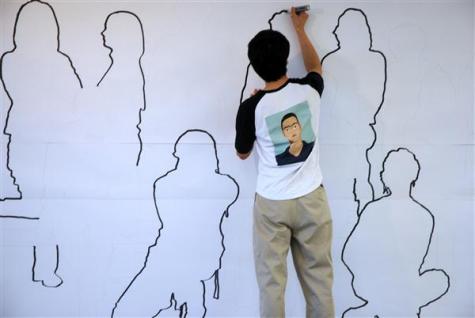
The site-specific wall drawing, an outlined portrait of the graphic design '08 MFA candidates, is documented in a time-lapse video placed alongside. By watching the video, the viewer is invited into the micro-world of the department, where each student is responsible for a portion of the outline that will stand for their portrait. Of course, the outlines remain empty, and the video offers a point-of-view of the back of each artist. This leaves it up to the viewer to "fill in" the blanks, perhaps to assign a face and personality to the graphic designer, a role which outside of the microcosm of school often exists as a transparancy (or work horse!) behind which the work itself takes center stage.
This stands in ironic contrast to the role of the "art star" that comes to mind when one considers the high stakes luminaries of the contemporary art world, into which the entire crop of RISD MFA candidates now emerges. (For another take on this, see part 6!)
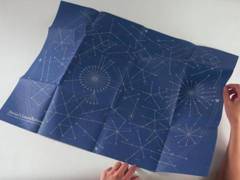
Also of great interest were Kwok's visual and narrative explorations of social ties, in a print series titled "Social Constellations" (depicted below), and video, "Sociograms", which can be viewed as a Quicktime movie on her website.
"STYROFOAM" at RISD Museum for Artscope Magazine (May/June 2008)
")
STYROFOAM
Rhode Island School of Design Museum
through July 20th, 2008
<<--CLICK HERE TO VIEW THE FULL ARTICLE-->>
By Meredith Cutler (for Artscope Magazine)
Name a lightweight, manmade material that emits toxic vapors when heated, yet is historically used to package food. It can be carved or molded; it floats on water and is stubbornly non-biodegradable. If you are still stumped, this controversial substance is expanded polystyrene, commonly referred to by its trademarked name: Styrofoam™.
Fraught with environmental pitfalls and increasingly banned by municipalities for use as food-service packaging, expanded polystyrene nevertheless offers many material qualities that make it attractive to artists. Concisely curated by Judith Tannenbaum, the “Styrofoam” show offers a survey of Styrofoam art created within the past 25 years.
Several big names are represented, such as Richard Tuttle and Sol LeWitt, whose posthumously installed “Black Styrofoam on White Wall and White Styrofoam on Black Wall” starkly greets visitors upon entering the museum, flanking the stairway to the main gallery.
Soaring above, the gravity-defying silver expression of Heidi Fasnacht's “Exploding Airplane” does nothing to quiet the unease surrounding ongoing terror alerts and the recent airline maintenance debacle.
Contrastingly grounded and modestly introspective, Shirley Tse's “Do Cinderblocks Dream of Being Styrofoam?” clings to the gallery wall at eye-level, inviting close inspection of the hand-carved markings tattooing its otherwise banal, utilitarian forms.
The small size of this show lends itself to a balanced viewing, which pays off when one encounters subtle, conceptual work such as B. Wurtz's “Untitled” sepia-toned photographs of implied architectural sites, or Steve Keister's Mesoamerican-inspired cast resin wall reliefs, all composed from the dips and bulges of molded packing containers.
With work ranging from Folkert DeJong's over-the-top figurative sculpture to hidden messages embedded in Bruce Pearson's colorful wall reliefs, “Styrofoam” offers the viewer a perspective on individual artists as they push the physical and conceptual boundaries of a material ubiquitous to the consumerism and material waste now so publicly called to question.
REVIEW: "Welcome To The Conversation": RISD Graduate Thesis Exhibition, Part 4
Mon, 06/02/2008 - 12:25 — adminHopefully, many of my local readers took the opportunity to visit the RISD Graduate Thesis Exhibition, which wrapped up yesterday. As for myself, I had to return to the exhibit hall several times to take it all in. While I cannot go into great detail on each and every artist, or nuance of the exhibition, I hope here to draw attention to what I considered the highlights of the visitor experience.
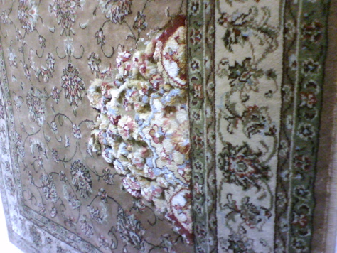
On my first pass through the cavernous hall, I was pleased to discover the work of Maryam Molki, a MFA Painting candidate of Iranian decent. Although a painter, Molki focused her thesis work on a series of altered mass-produced rugs, hung vertically on the wall to be viewed rather than walked upon.
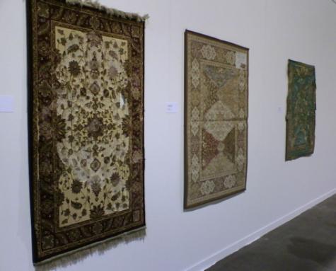
Admittedly, I had just come from an informal kilim rug "purchasing consult" for a friend, but I was drawn to the excersise of excessive material removal and subtle reconstitution that Molki perpetuated upon these mass-produced, "Made In China" specimens. I should note that photos don't do these pieces justice. Like many works in fiber, the ability to examine the work close up, with tactile focus, is key.
Also from the painting department, and working rather sculpturally, is Cassie Jones. Playfully grotesque, her dimensional paintings grow from the wall in kitchy shades of flesh, "astroturf" green and grey. Referencing building materials, skins, and invented topographical maps (of alien planets)...
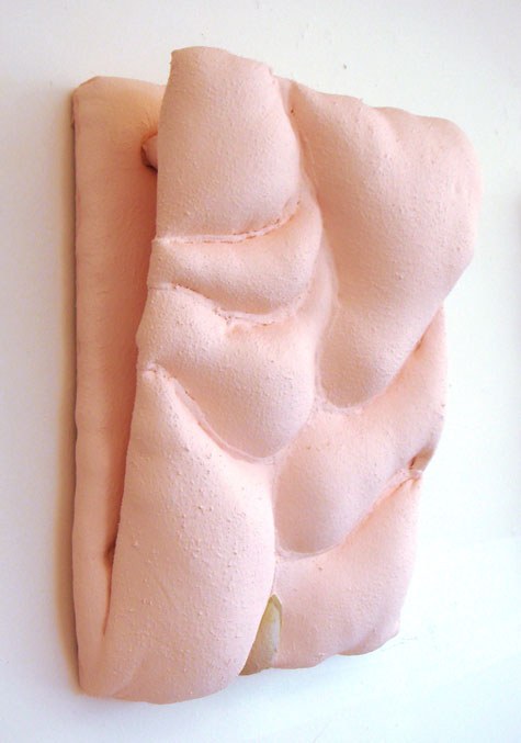
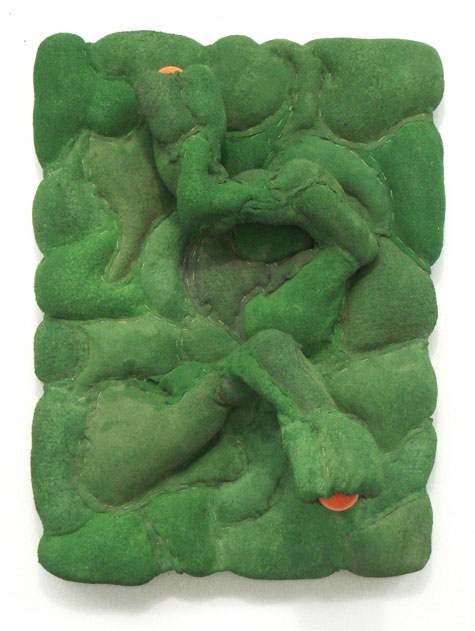
I have always gravitated towards gnarly painting. With its hoof-like protrusions, the piece depicted above is as gnarly as the Incredible Hulk's bathmat!
REVIEW: "Welcome To The Conversation": RISD Graduate Thesis Exhibition, Part 3
Fri, 05/30/2008 - 11:20 — adminThere is so much to talk about when it comes to the latest crop of RISD designers and artists. With the most challenging faculty, and access to the newest technology, it's no wonder that the design world looks to the graduates of this institution for fresh creative solutions.
That said, "flash and dazzle" cannot compare to time-honored traditional skills and the fine craftsmanship essential to creating artisan furniture. Embodying the best of both worlds is one of my favorite up and coming furniture designers, Zeke Leonard.
Zeke's reclaimed oak wall sconces, (which I covered in this archive post), clung cheerfully to a massive white wall, not suffering in the least from the expanse. A certain modest quality in these fellas evokes a sense that they could "live" anywhere, which I love. In contrast, and new to my eye was his massive "Boat Chair", impressively cantilevered over the exhibition space with the help of a reclaimed Red Oak arch and a hand forged steel chain. To give you a sense of the scale, this hanging chair could easily accommodate a couple...
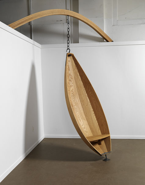
Whether modest in size or massive, Zeke's work retains a confident, yet approachable presence that I always appreciate. You can explore more of Zeke's work at his website.