- artists (39)
- career (11)
- contest (1)
- crostini (14)
- design (27)
- DIY (3)
- drupal hell (3)
- etsy (18)
- events (35)
- family (6)
- fun with google (6)
- gocco (6)
- I covet thee (13)
- Io parlo Italiano (10)
- lost and found (13)
- mc recommends (33)
- mixed media (25)
- multi-tasking (11)
- photo documentary (15)
- playing with food (5)
- projects (3)
- providence (39)
- reviews (23)
- sailing (1)
- site updates (4)
- softies (6)
- storytime (4)
- studio (21)
- the road less travelled (15)
- think green (8)
reviews, artists, Authored Articles
"DORA ATWATER MILLIKIN: GEOMETRY OF PLACE" for Artscope Magazine (July/August 2008)
")
DORA ATWATER MILLIKIN: GEOMETRY OF PLACE
At the Newport Art Museum
June 7 – August 10, 2008
<<--CLICK HERE TO VIEW THE FULL ARTICLE-->>
By Meredith Cutler (for Artscope Magazine)
Aptly titled, Rhode Island painter Dora Atwater Millikin’s “Geometry of Place” is now on view at the historic campus of the Newport Art Museum. While the manicured surroundings echo a sentimentality of time and place ubiquitous to this oasis of beachside mansions, Millikin’s unconventional landscape oil paintings provide a neutral view, absent of the clichés you might expect to encounter there.
Scattered between the coastal cities of New Bedford and Newport, the artist notes objectively of her subject matter: “It’s southern New England; it’s my world. I’ve lived by this stuff all of my life.”
At first glance, the forms seem familiar enough: fishing trawlers, tugboats, sleepy seashore side-roads, sometimes punctuated by the bulk of a rusty truck or camping trailer. Look deeper, and Millikin’s unusual compositions will anchor you, allowing her more formal concerns to emerge as attachments to narrative dissolve.
“It is, first, a composition – a snapshot of everyday life”, Millikin states. “Subject matter is not the most important thing to me; it’s not meant to be spectacular, or fancy. I’m trying to create an abstraction, and I do this also through [the placement of] lights and darks.”
As infants, the delineation between light and dark is the first visual impulse we perceive. It’s this primal impression that these paintings draw upon, with varying levels of application and intensity. Certain elements enjoy a preferred role in these varied snapshots - namely: asphalt, telephone poles, and rigging. Where these are used to define the picture plane, the intention of the artist truly shines through.
“There is so much rhythm and balance, I get so much out of it”, Millikin mused, when asked about her compositional attraction to these elements. “It’s meant to read like a song.”
In “Morning on Main”, a line of utility poles recedes off-frame, while anonymous bungalows cluster behind as a silent anchor. The sky is rendered in a series of buttercream sections, pinned like quilt squares between a network of intersecting telephone lines. The artist confides that in relation to the source location, are heading straight into the sea.
“But hopefully you would never know”, she laughed.
Working instinctually from her source sketches and photographs, if you were to take any one of the finished paintings to the original location, you would probably scratch your head and wonder, “What was she thinking?”
“Most of the actual painting is done in the studio, from no resource; no photograph… nothing. It is painted for the sake of the painting itself. I never work from someone else’s source”, she emphasized.
Unlike the conventional method of painting, in which a background is applied and the forms then laid on top, Millikin first draws the subject, or positive image, and then defines it with the negative image in thick strokes of oil paint. “For the sake of the composition I’m always adding or subtracting”, she explained.
A graduate of the Old Lyme Academy of Painting in Connecticut, Millikin’s rigorous, traditional training included a strong emphasis on life painting and the human form; which, interestingly, appears infrequently or largely simplified in her work. Only one painting, titled simply “Early Morning”, depicts a human figure in full frontal view, approaching almost through the large-scale picture plane.
It is important to note also that Millikin works from a primary palette, which consists strictly of red, yellow, blue and titanium white. All subsequent colors are mixed from this pure set, resulting in a harmony of color balance within her paintings. These subtleties of technique effectively imbue the work with a richness and accessibility altogether separate from the subject matter.


Weekend Roundup: First Beach, Then Art
Sat, 08/02/2008 - 11:02 — adminAs my Italy tan threatens to fade, there is nothing I look forward to more than a steamy, early August beach weekend here in Little Rhody. I'm firing up the flipflops and prepping the watermelon already!
Lest I lose all self respect while lathering on the 45 SPF and a dab of Jergens Natural Glow, let me recount the various other good things in the world of art and culture that await this weekend, just a stone's throw from the sandy shores of the Narragansett Bay and Atlantic Ocean.
All this weekend, at Fort Adams State Park: The Newport Folk Festival draws the indie crowd alongside the tried and true folkies, with low-key-cool acts like She & Him, Cat Power and Calexico sharing the stage with legends like Richie Havens.
Having made the journey to Newport, stay awhile and check out Saturday's Gallery Night, with free parking available at the Newport Art Museum.
As shown above, opening tonight at Jessica Hagen Fine Art + Design, new mixed-media paintings by Rhode Island native, Kevin Gilmore. Read my full review in this month's Artscope Magazine.
Just up the street at DeBlois Gallery, Street Art: In & Out opens tonight, with graffiti artists creating a site-specific work live in the gallery's front window.
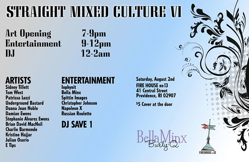
Heading back to Providence for the night, stop by Firehouse 13 for the opening of Straight Mixed Culture, a group show of Providence artists celebrating Providence culture "as it is". Word.
"KEVIN GILMORE: RECENT PAINTINGS" for Artscope Magazine (July/Aug 2008)
")
Kevin Gilmore: Recent Paintings
August 2 - September 7, 2008
<<--CLICK HERE TO VIEW THE FULL ARTICLE-->>
by Meredith Cutler (for Artscope Magazine)
Article excerpt:
In his fourth solo show at Newport’s Jessica Hagen Fine Art + Design, emerging artist Kevin Gilmore returns to his former locale with a body of mixed-media paintings redolent of journeys, destinations and new digs in Brooklyn.
Originally from Rhode Island, Gilmore received his BFA from Rhode Island College in 1999, with a concentration in collage and painting. Looking west, he explored Jackson, Wyoming and Portland, Oregon, embedding himself in their art communities.
Eventually returning to his native state via Newport, he was discovered by gallery owner Jessica Hagen when he wandered as a cold call into Station 29 Gallery, for which she served as director prior to opening her own gallery in 2005. Hagen responded immediately to Gilmore’s work, agreeing to represent him exclusively to her well-heeled regional clientele, who gravitated to the unpretentious work of the young painter...
<<--CLICK HERE TO VIEW THE FULL ARTICLE-->>
Image: Kevin Gilmore, "Arrondissment", 2008, oil on panel.
REVIEW: Quadriennale d'arte di Roma
Tue, 06/24/2008 - 12:01 — adminCiao ragazzi! The mercury here in Rome hovers around 40 degrees Centegrade (which is the upper 90's for those of you in the realm of Farenheit). What better excuse then to take refuge in the cool marble halls of an art museum! For my first visit to the Palazzo delle Esposizioni, we were able to catch the 15th Quadriennale d'arte di Roma, which runs through September 14th.
As an outsider to the here and now in contemporary Italian art, this was a good introduction. However, like many survey format shows, which must be a nightmare to curate, I have to admit that it left me feeling a bit lost for vision at the end.
Primarily comprised of emerging and mid-career artists, the show spotlights 99 living artists, with a special (post-mortem) tribute to a 100th, Arte Povera sculptor: Luciano Fabro. During our visit, the museum staff was busy building a large platform for one of his final marble sculptures: "Autunno"; up to this point, not yet shown in public. The casino created by this construction caused an unfortunate interruption of some of the more subtle sound environments and video installations on the 1st floor; for example: Mariateresa Sartori's video installation "Il concerto del mondo". This subtle piece, a video cropped to the mouths of various paired speakers, each vignette in a different language, was accompanied by a soundtrack of music composed to match the rhythm and volume of the subjects as they conducted their conversation. Unfortunately, the excess of ambient noise outside of the viewing room did not serve the interests of this piece.
At a loss to interpret some morbidly lush paintings clustered on the ground level, I found myself drawn to a pair of rather cheeky works in animation shown on the second level of this gorgeous palace. The first, Federico Solmi's "King Kong and the End of the World", was a joyous F.U. to the excesses of American capitalist culture and an energized animation, to boot. Scenes of "the artist as King Kong", sporting a ballooning red erection while smashing the Gagosian Gallery to bits with the edifice of the Guggenheim had me crowing with laughter. I appreciated the way that the museum installed a large selection of original drawings from the animation around the plasma video display. The style, very "schoolkid doodling in the margins of his notebook" was accessible in a way that just barely obfuscated the naughty bits of the subject matter.

"Eine Symphonie Des Greuns", an animated environment by Andrea Mastrovito, featured similarly sketchy drawing style; in this case doubly projected in black and white over a still scene comprised of A4 sheets of paper photocopied and taped simply to the wall. The animation, a dreamlike sequence toying with the self-generated birth and death of a bearded young dude, was surreal in a way that reminded me of Rami Farah's narratives in Julia Meltzer and David Thorne's work shown at the Whitney Biennial.
Incidentally, it was impossible not to notice a heavy influence of British pop-music on this generation of Italian artists, as this piece was accompanied by a looped clip of the intro to Radiohead's "No Surprises" - and the former, by what I sketchily identified as the piano bridge in Eric Clapton's "Layla"...
I admit that I found myself a bit alienated from much of the formal work in the show, and my non-artsy husband, although born and raised in Rome, was no help to me in interpreting the movements behind the evidence. Paintings to my eye were morbidly garish, depicting either grossly overgrown vegetated environments or circus nightmares. Sculpture resonated fairly flat, with the exception of a lovely trio of maps, delicately carved into bars of cream-colored soap by Elissabeta Di Maggio. These pedestalled tesserae depicted, in turn, full aerial street maps of La Città di Messico, Parigi, e Algiers. Each complete map was enclosed in a lovely red linen box display, with the city name penned on an ornamental label.
Leaving the cool marble oasis of the Palazzo, we sported nostri casci and sped away on nostro motorino.
REVIEW: "Welcome To The Conversation": RISD Graduate Thesis Exhibition, Part 7
Fri, 06/06/2008 - 18:22 — adminIt's high time I wrapped up this week-long review of the RISD MFA program thesis show, "Welcome To The Conversation". As I tend to do with my eating habits, and so with posting...here I am savoring the sweetest morsels for the last bite. Luckily, I saved some room and have a coffee handy.
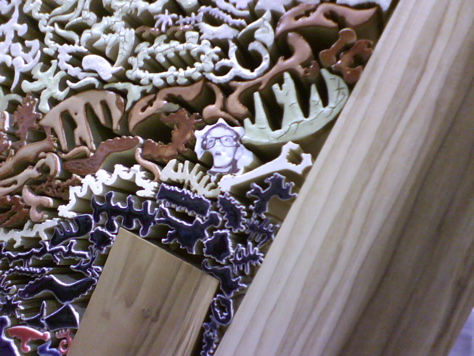
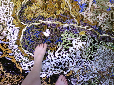
I've reserved this last post for the work of ceramicist Nathan Craven. His installation "Gordon and Martha Behr It All" is one of those pieces that has to be visited with, and not just looked at. A sprawling, interlocking network of individually fired, extruded ceramic units; the work is visceral, beautiful, evocative and joyful.
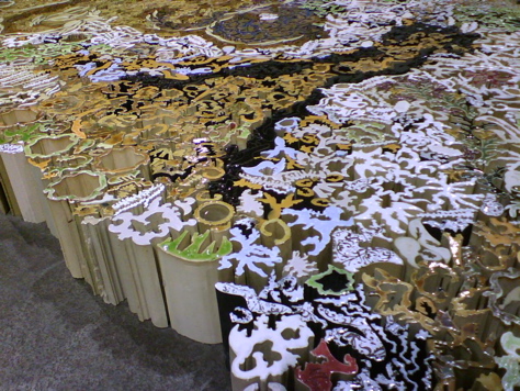
A labor-intensive, obsessive arrangement, the microcosm of individual units interlock to create structure, and read like the cells of a massive endangered coral reef. There are discoveries and humor in the piece as well, with peepholes, an embossed "river" of what look like Rorschach blot tools, and a goofy "Where's Waldo"-esque portrait of what I was told (by a fellow graduate) is the artist's young son, peering out in wonder and horror at the spectacle.
If not already overstimulating, the strength of the combined network of elements is enough to support the physical weight of the viewer - and we were encouraged to walk upon the piece, like Jesus on water. The tactile exhilleration and forbidden pleasure of this action was evocative of walking over coals, or treading on a very expensive Persian carpet.
From what I saw and experienced under the artificial lights of the convention center, Craven's work has a talent for bringing people together in conversation and mutual wonder. One can only imagine what the results would be of giving a piece like this a more permanent home in a public arena; like a park, library courtyard or greenway.
Speaking of public space, for an overview of thesis projects by the students of landscape and interior architecture, which I haven't had a chance to cover in detail, please visit their respective webpages, which I have linked to above. Also for your perusal, works by the department of industrial design, hopefully coming soon to a forward-thinking retailer near you.
Congratulations to the RISD MFA Class of 2008!